You undoubtedly already know that practically every single website out there hosts a plethora of all kinds of various links, whether you’re a website owner or just a casual visitor. It makes sense because using these links will swiftly move you between different parts of the website.
There are two main types of links: internal and external. While internal links on a website often take us to another location within the same domain, external links typically take us to other third-party websites.
Every website developer should be aware that these third-party links can often lead to harmful Internet pockets. Therefore, it’s crucial to let users know whenever they are actually leaving your page via one of these external links.
What more effective way is there to accomplish this than by creating a popup message that offers the user the choice to leave or remain on your website? Today, we’ll show you how to create one of these popup messages using our newest WordPress plugin, WP Links, so you can always keep your users safe and secure!
Contents of Post
Exit Confirmation
Among its numerous features, this plugin lets you specify the guidelines that each link on your website must follow. The main section where you will be designing your new popup message is the “Exit Confirmation” tab.
The preview button, which allows you to see how your popup will appear before deciding to use it on your website, is the first item you’ll notice under this section.

Pick a Color
After this, you are met with a pretty straightforward and beginner-friendly editor. First, you get to pick what the background color of your popup message will be.
You can pick any color within the RGB color palette or enter a specific RGB code you want to use.

Create Your Title
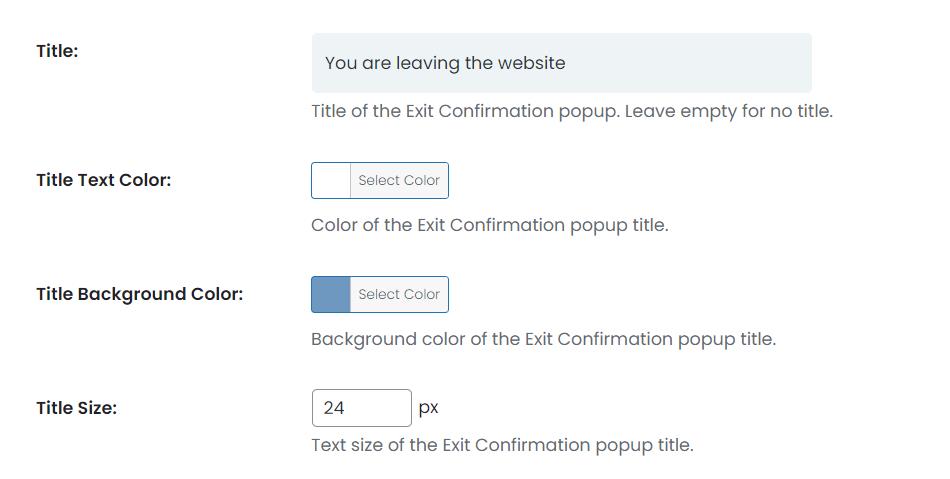
Next up, you can enter your own custom title, or you can leave this window empty. Either way, you are able to adjust the color in the same fashion as your background, after which you can decide on what the title’s background will be as well.
When it comes to the letter size, you can adjust that here as well, but keep in mind that the size should make sense in contrast to the entirety of the popup message, so it might be best to get back to this step once you’ve decided on the size of your popup window altogether.

Write an Enticing Popup Message
Following this, you are now met with a window in which you are supposed to enter the popup text. You can get pretty creative here, as you can use your writing skills to entice the user to stay on your website!
Either way, make sure you don’t write essays here-it is a popup message, after all!

Adjust The Size and Color of Your Message
Naturally, you can also adjust the color of your text here, as well as the letter size. Once again, make sure that these colors and letter sizes make sense together because even though this might seem like a minute thing on your website, it’s still important to hold some aesthetic value.

Decide on Popup Placement
Now that you have written down your title and the actual text of the popup message, you can adjust how large you want the popup to be. You can adjust the popup’s width here as well as its position on the website.
If you leave the height of the exit confirmation tab unchecked, the plugin applies its own automatic height values instead.

Add a Colorful Overlay
After deciding where on your website you want your pop-up message to display, you can now add an overlay that will appear when a user clicks an external link. This overlay is transparent, but you can adjust the color of the overlay to something darker within the color picker, so your message can really pop against the background (pun intended).

Customize Your “I Want to Stay” Button
So you have now adjusted mostly everything. You are only left with creating the button which will keep the user on your website.
Usually, this button says “I want to stay,” but you can really put anything there, as long as it notifies the user that they won’t actually be leaving the website.

Finish and Save Your Work
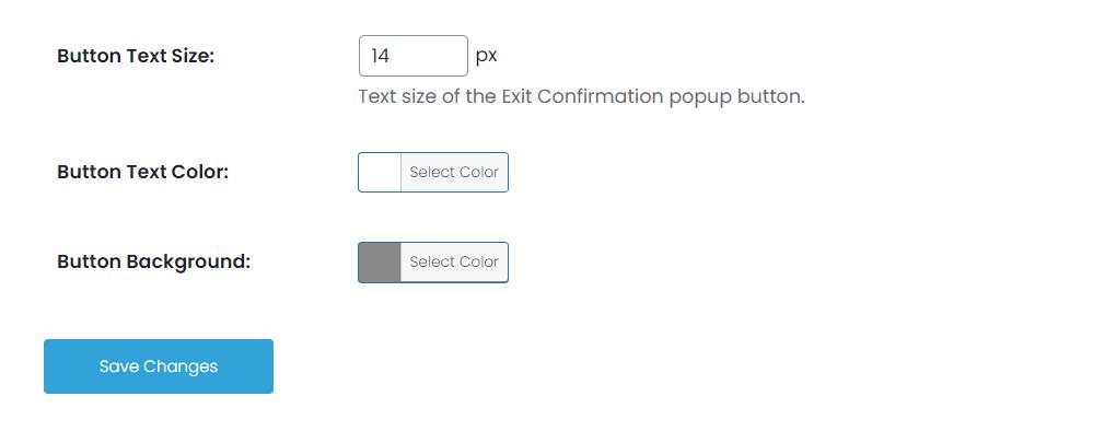
Once again, you can adjust your button’s letter sizing here, as well as the text color and the color of the button’s background.
By doing this, you have now successfully created your popup message, and all that is left before you add it to your links is to preview it by going back to the beginning of the editor, and you’re done! Just make sure you don’t forget to click save.


